
Case study · Redesign
Australian Skin Lab
A brand identity and e-commerce redesign to move a skincare brand off TV shopping and onto its own storefront.
Australian Skin Lab blends traditional Indian botanicals with modern skincare science, in formulas developed with Dr Tanya, a Gold Coast doctor.
- Role
- Product Designer (Part-Time) · Brand identity · e-commerce UI
- Client
- Australian Skin Lab Pty Ltd
Challenge
ASL sold mainly through TVSN, the TV shopping network, which took a share of every sale. After production and logistics, there was little margin left.
Brief
Rebrand the range and build a direct-to-consumer store, so ASL could sell on its own terms and keep the margin.
Research
Who buys these products?
Research started with who was already buying, and why ASL could stand out on a crowded natural-skincare shelf.
Buyers were mostly 28 to 55, shopping for skin tightening, anti-ageing and a healthy glow, results the range's traditional ingredients are known for.
Comparative Advantage
What sets ASL apart?
Plenty of brands claim natural ingredients. ASL could prove a tradition: long-established botanicals suited to all skin types.
Those botanicals are combined with modern actives, and every formula is backed by a practising doctor.
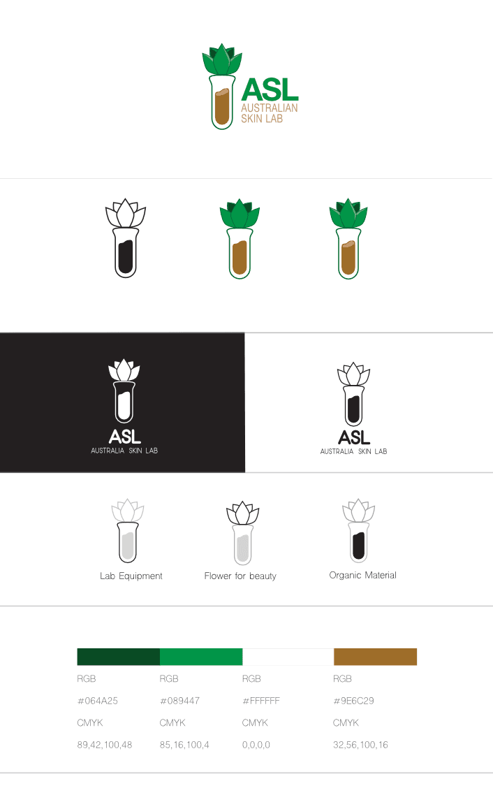
The Australian Skin Lab mark grew out of the brand's two strengths: ancient ingredient wisdom and modern skincare science distilled into one calm, confident wordmark. I sketched, refined and tested it across product packaging, storefronts, and social profiles to make sure it reads cleanly at every scale.

I mapped the shopper's path from landing page to checkout before designing a screen. That surfaced the gaps and extra steps in the old journey, and set one rule for the redesign: every step must help a buyer choose a product or pay for it.
Tip: click the diagram to open a zoomable view. Use the+and−buttons (or keys) to zoom in and read each step.
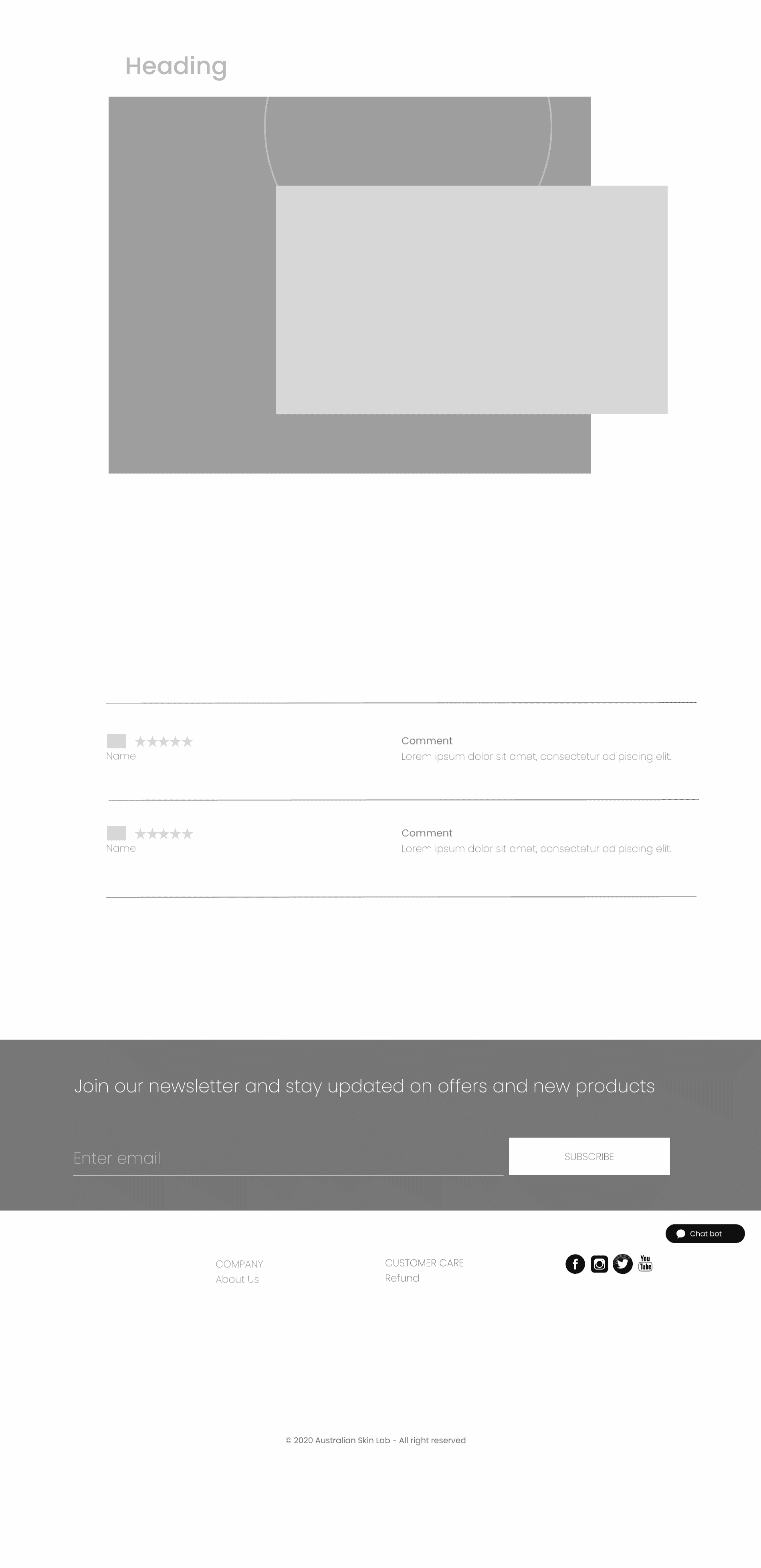
Layout and content order were settled in greyscale first, so the structure could be tested and fixed while changes were still cheap.
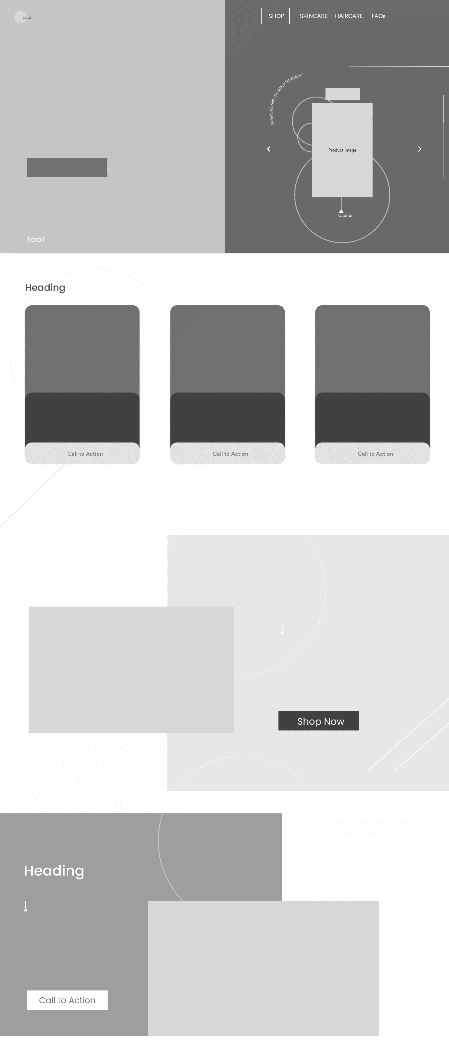
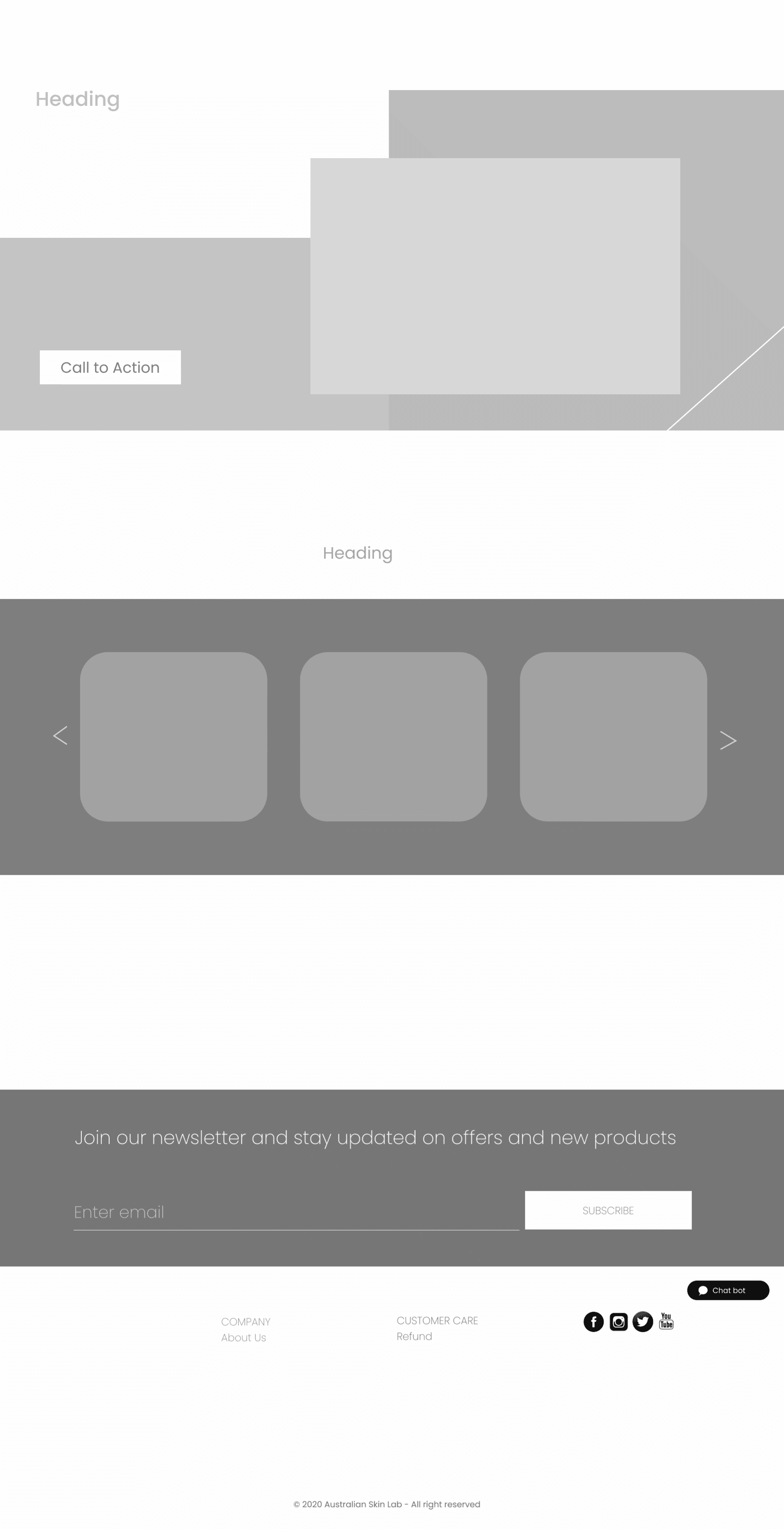
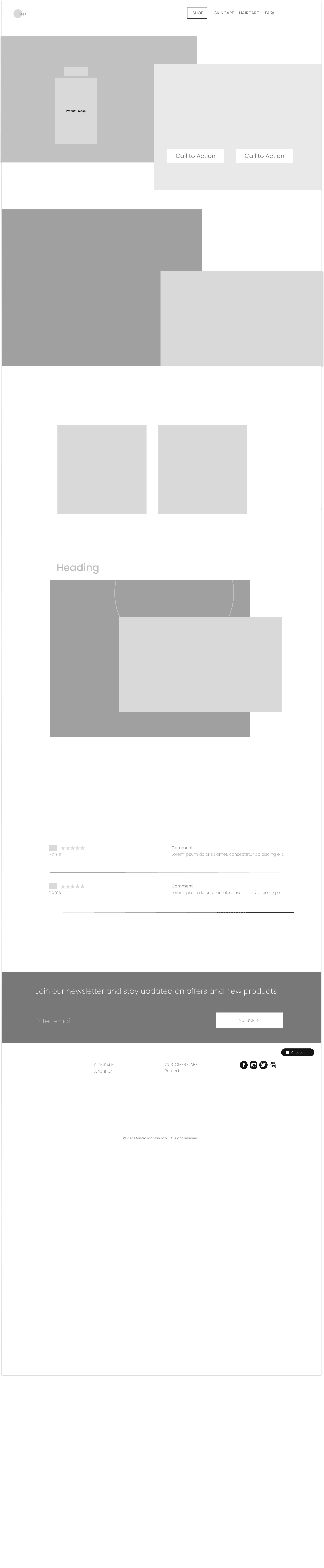
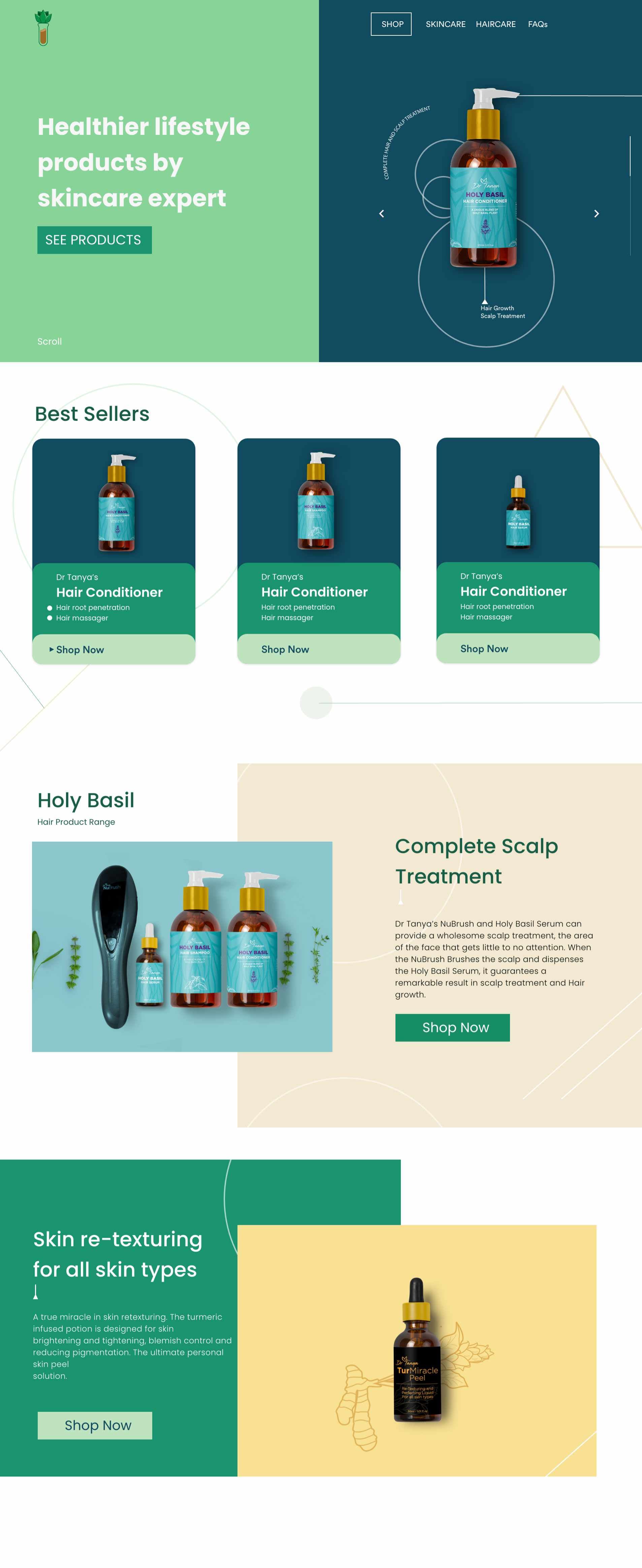
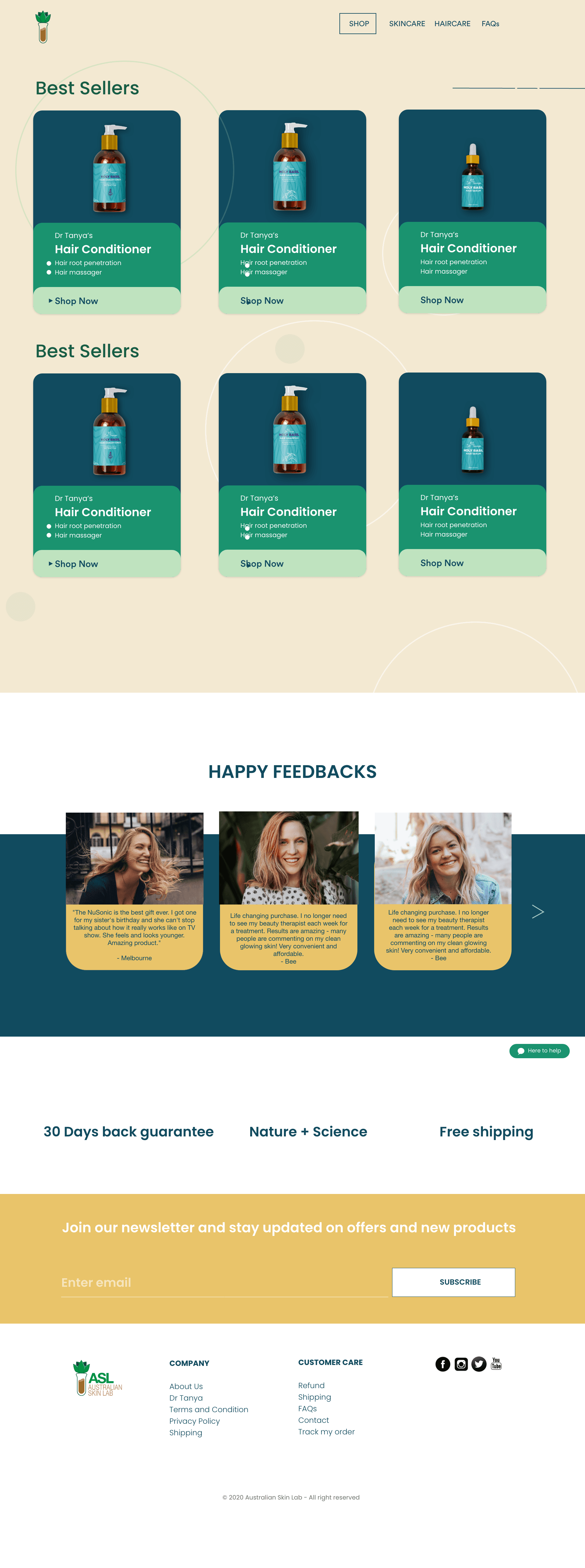
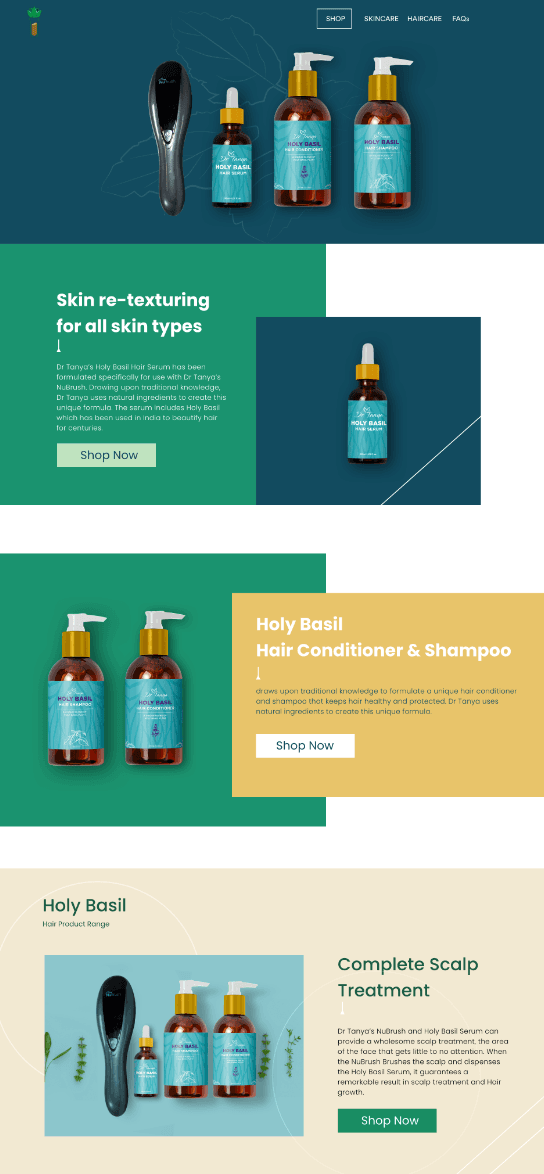
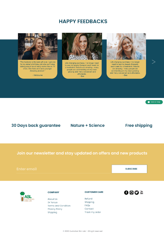
The final screens carry the new identity through the whole store, and were refined through user-testing sessions focused on usability and conversion.
In direct-to-consumer beauty, three things do the heavy lifting: a brand people trust at a glance, an ingredient story that's honest, and a checkout with no friction.